
Solarium is more than a sunroom company. Solarium sunrooms are a lifestyle. They promise an abundance of sunlight and nature in your life without the need to leave home, whatever the weather. They offer a wide variety of options and cater to the client’s needs. Solarium needed a logo, brand identity, tradeshow banner and brochure.
──────────── BROCHURE AND TRADESHOW SIGNAGE ────────────


PROCESS
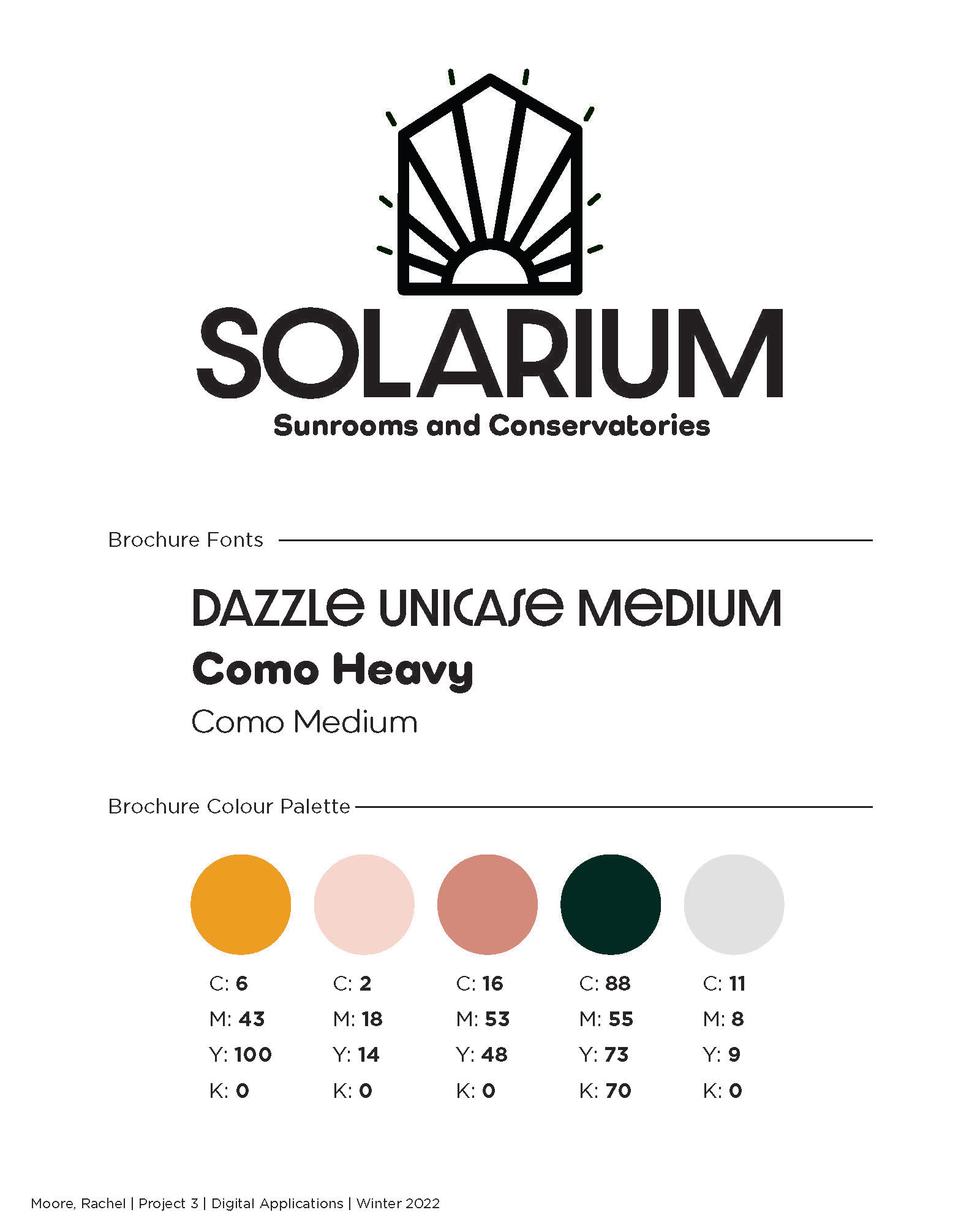
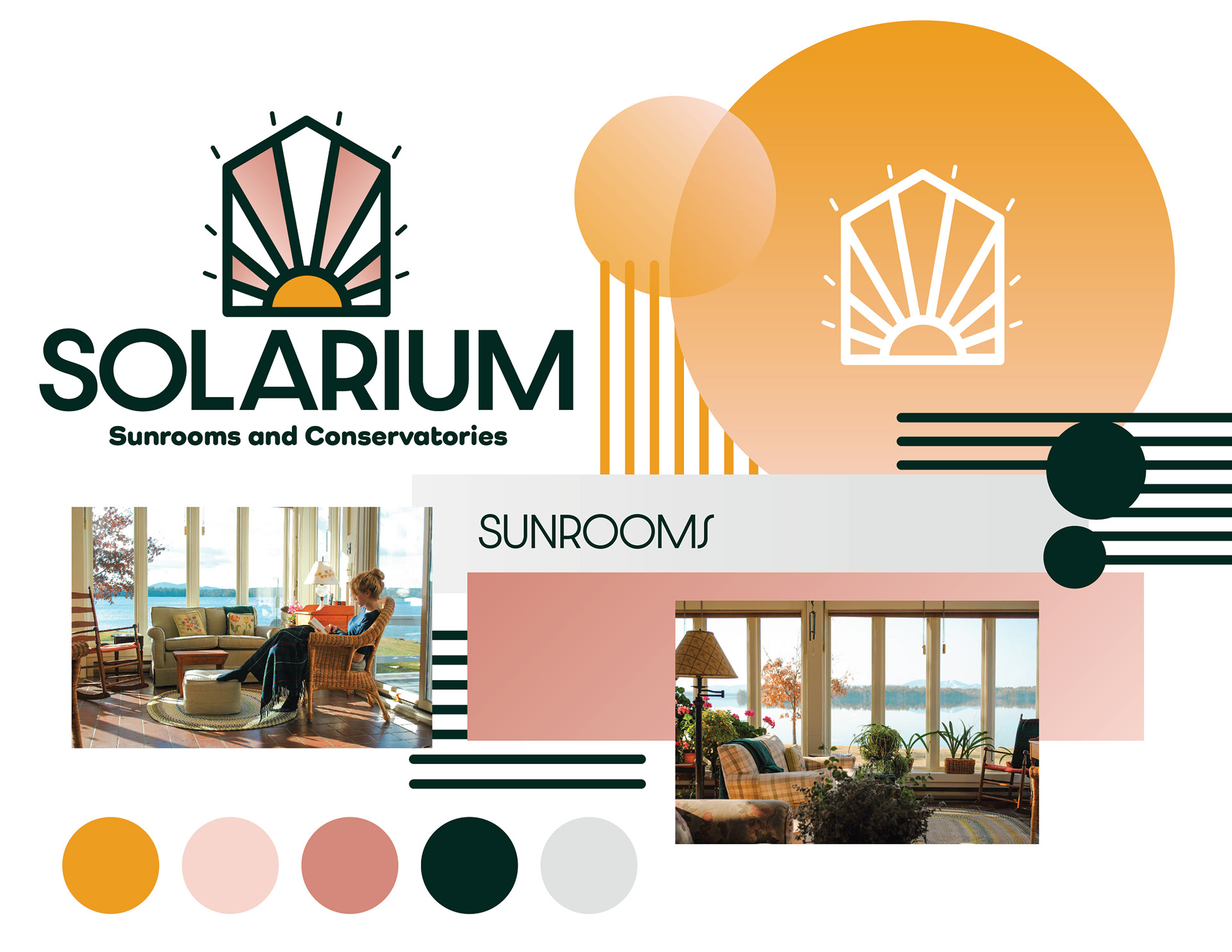
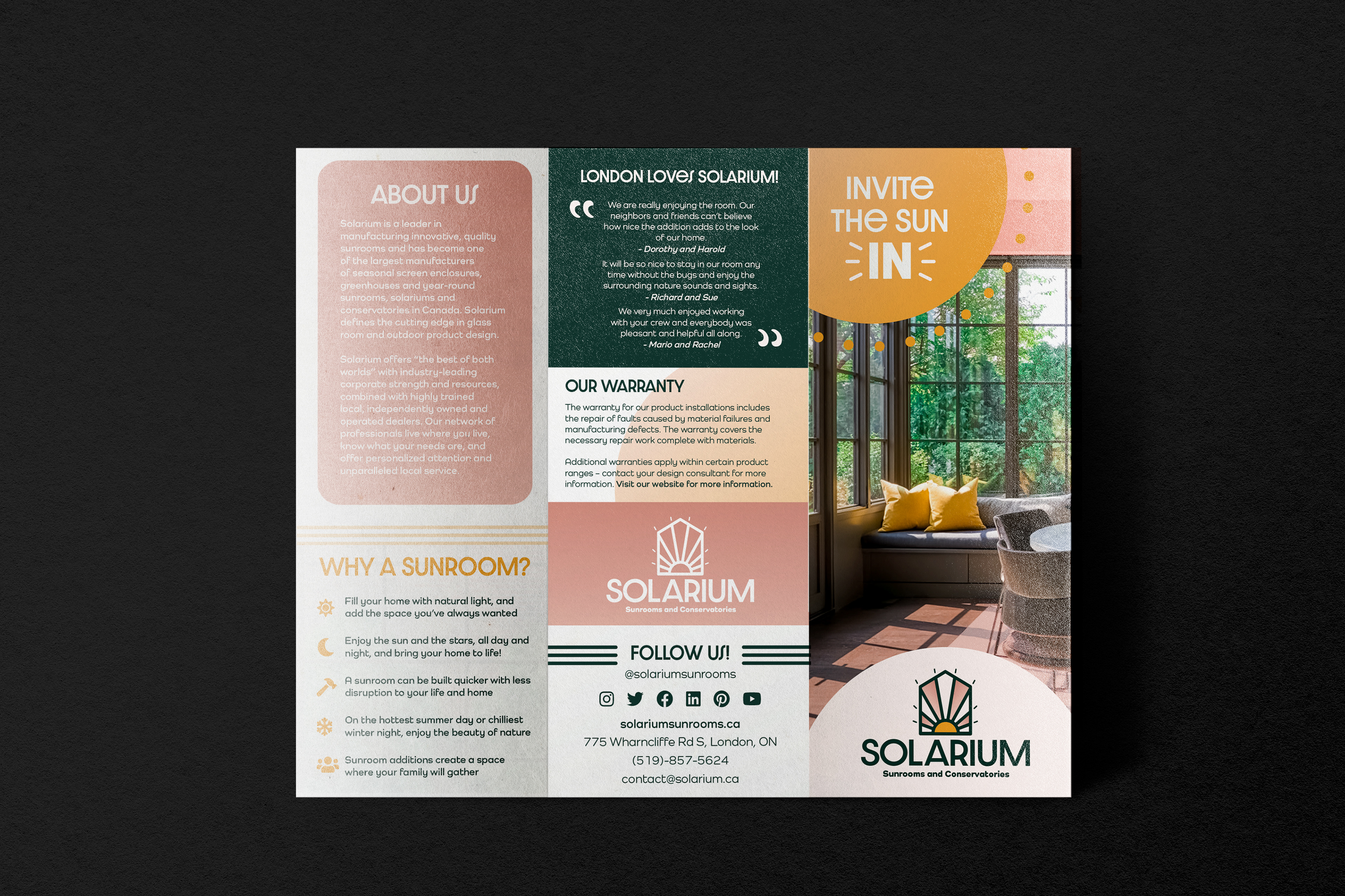
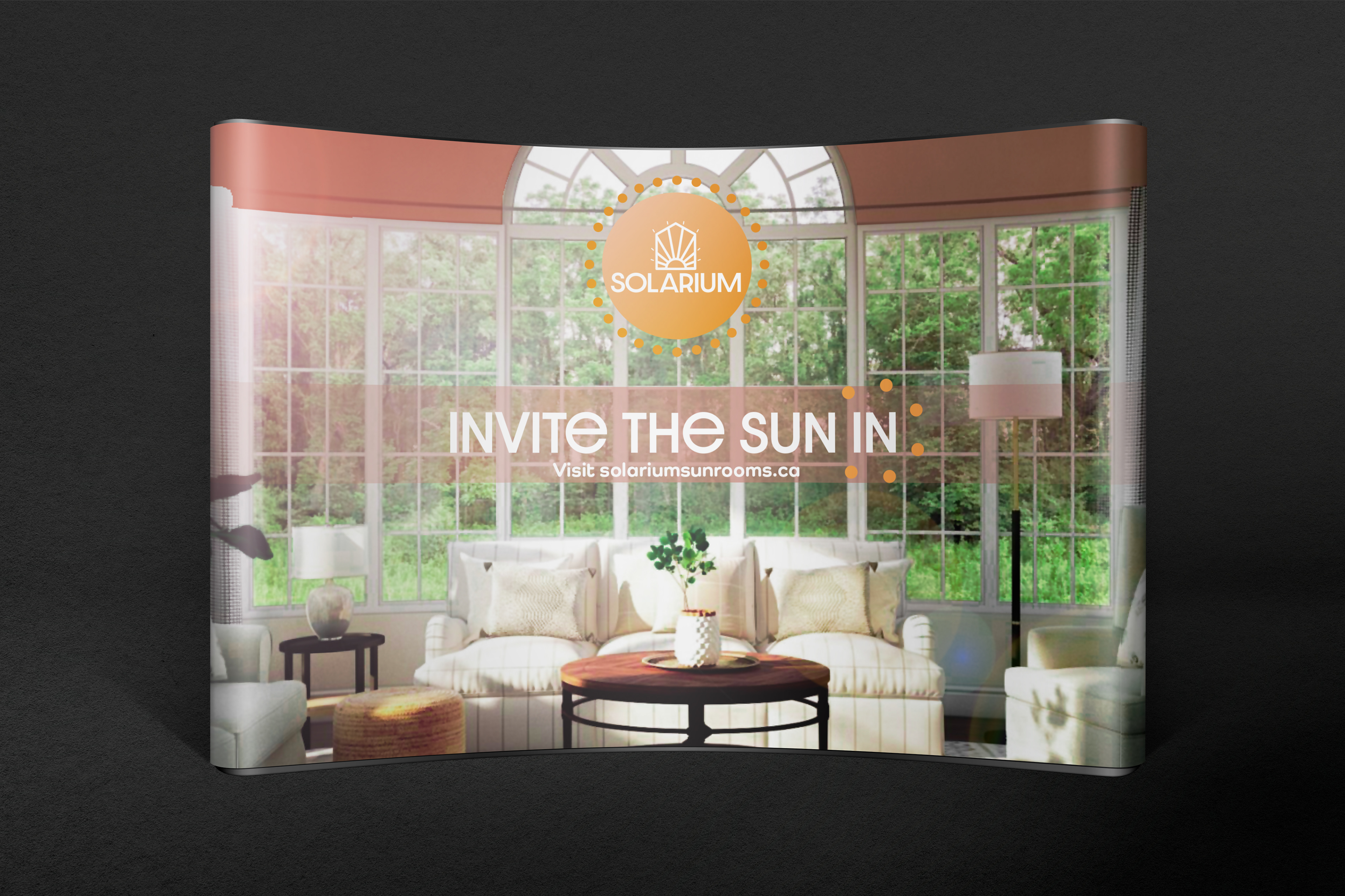
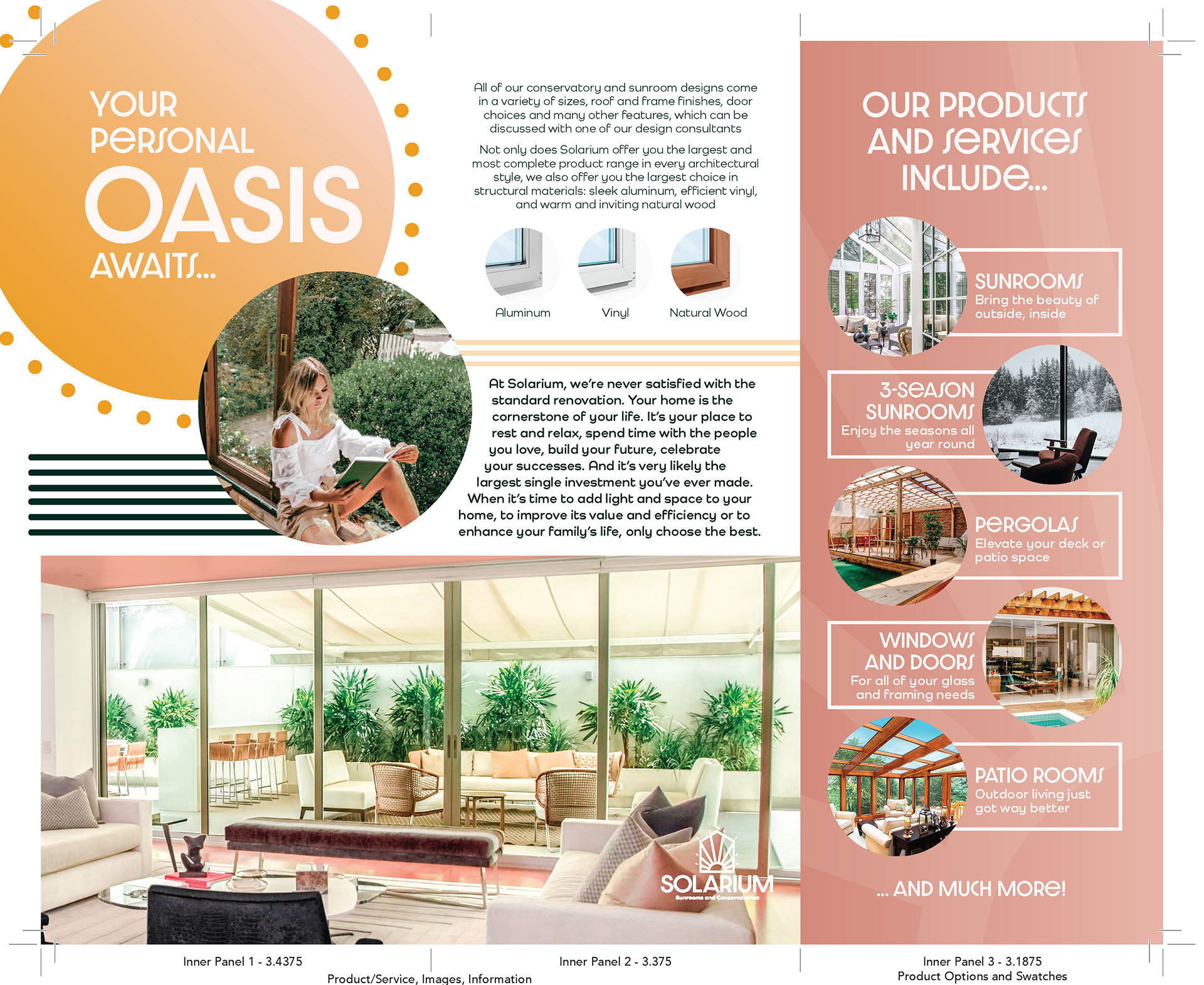
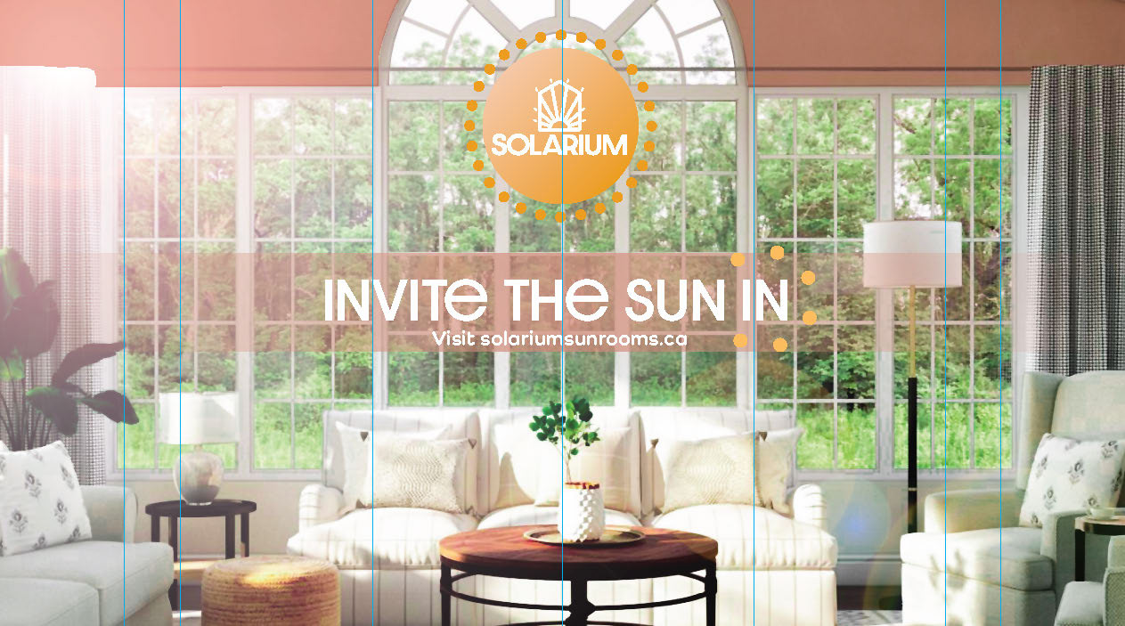
For Solarium’s logo I decided on a stained-glass inspired symbol with a sun beaming into the frame. I used colours that felt like a sunset; a golden yellow, cotton-candy pink, and cool shadow green. These colours are consistent in the branding, as well as sun shapes and horizontal lines that resemble blinds. The feeling of Solarium is bright, contemporary and cozy. I used lots of imagery with bright light sources and lots of nature visible to create an open and free feeling in the viewer. My main goal was to give this brand a big personality and a vision that people can relate to - to sell the company and not their products. I used a bold, art deco font and kept the designs simple and camling - while still being exciting.
MEDIUM/TOOLS USED
Adobe InDesign, Illustrator, Photoshop