Irregulars Sauce Co. isn’t your average sauce maker. Hence the name. Irregulars like to experiment and have fun with their sauce. It’s not about the heat; it’s about the multitude of flavours, trying new things and enjoying food. Irregulars needed an out-of-the-box package design and brand identity to complement their sauce-making.
──────────── PACKAGING AND DISPLAY ────────────


PROCESS
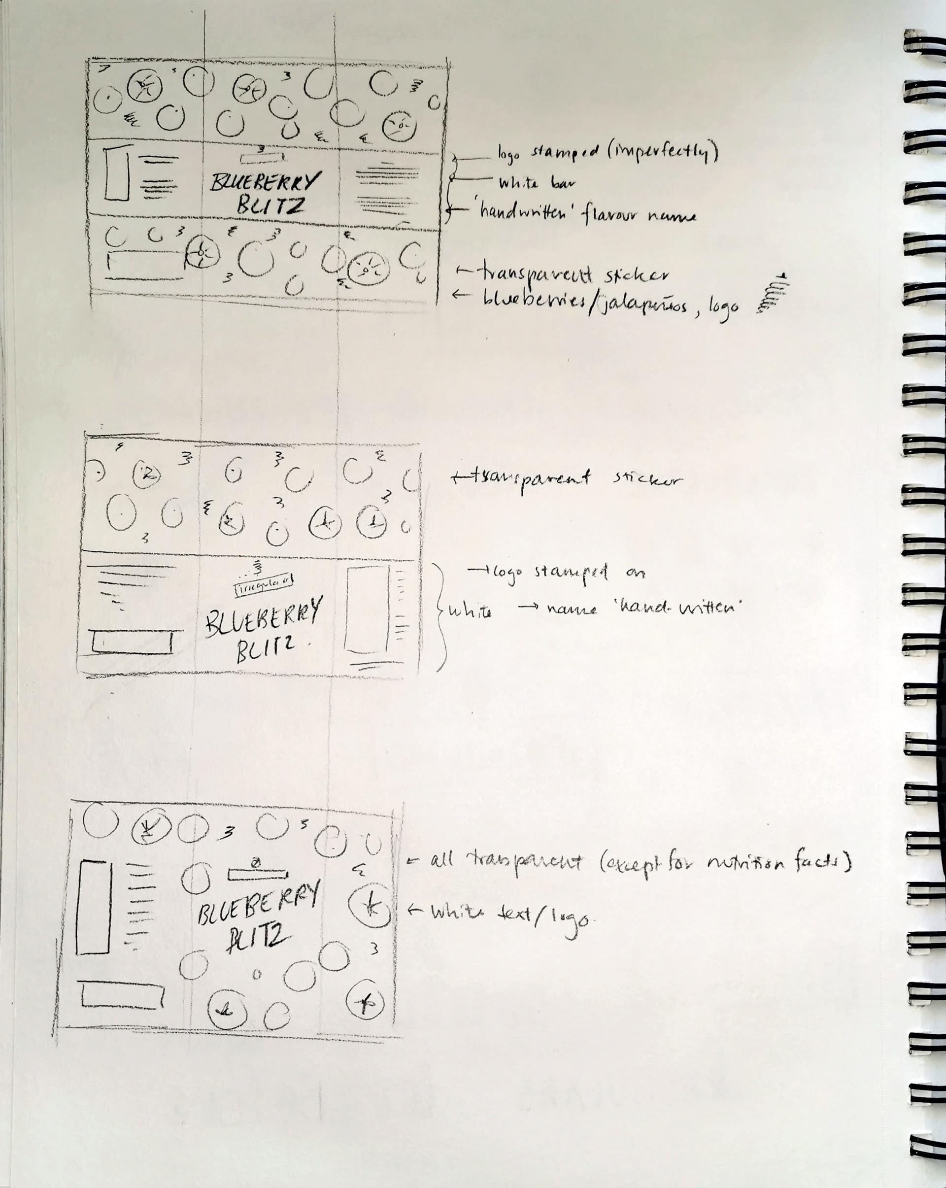
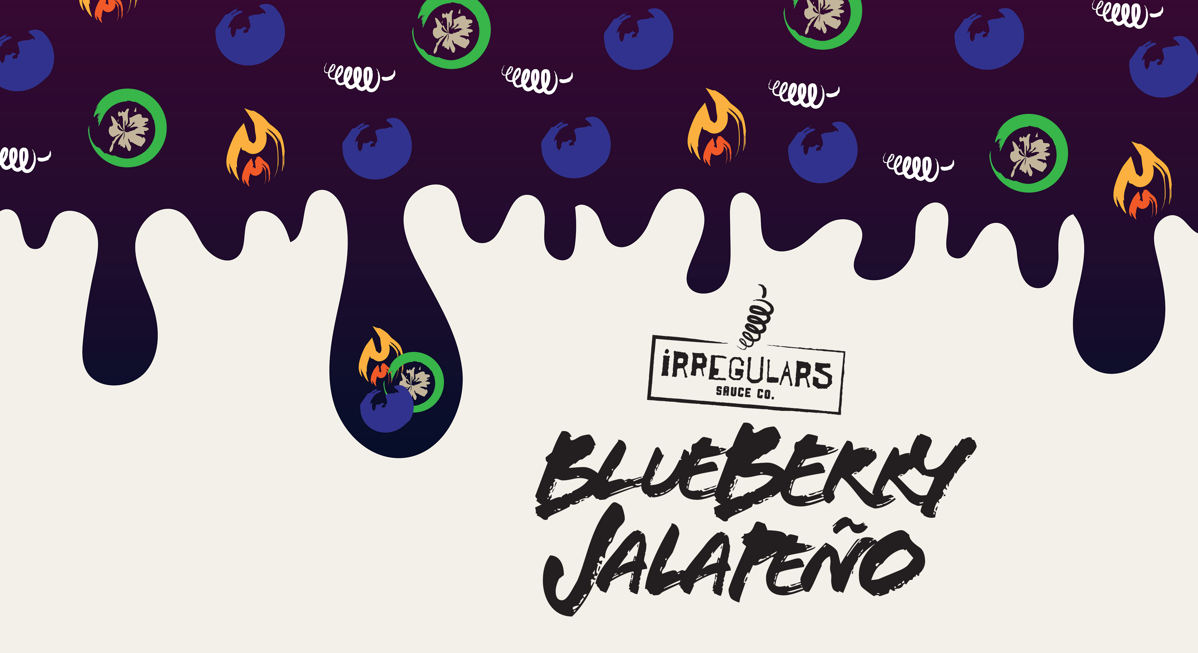
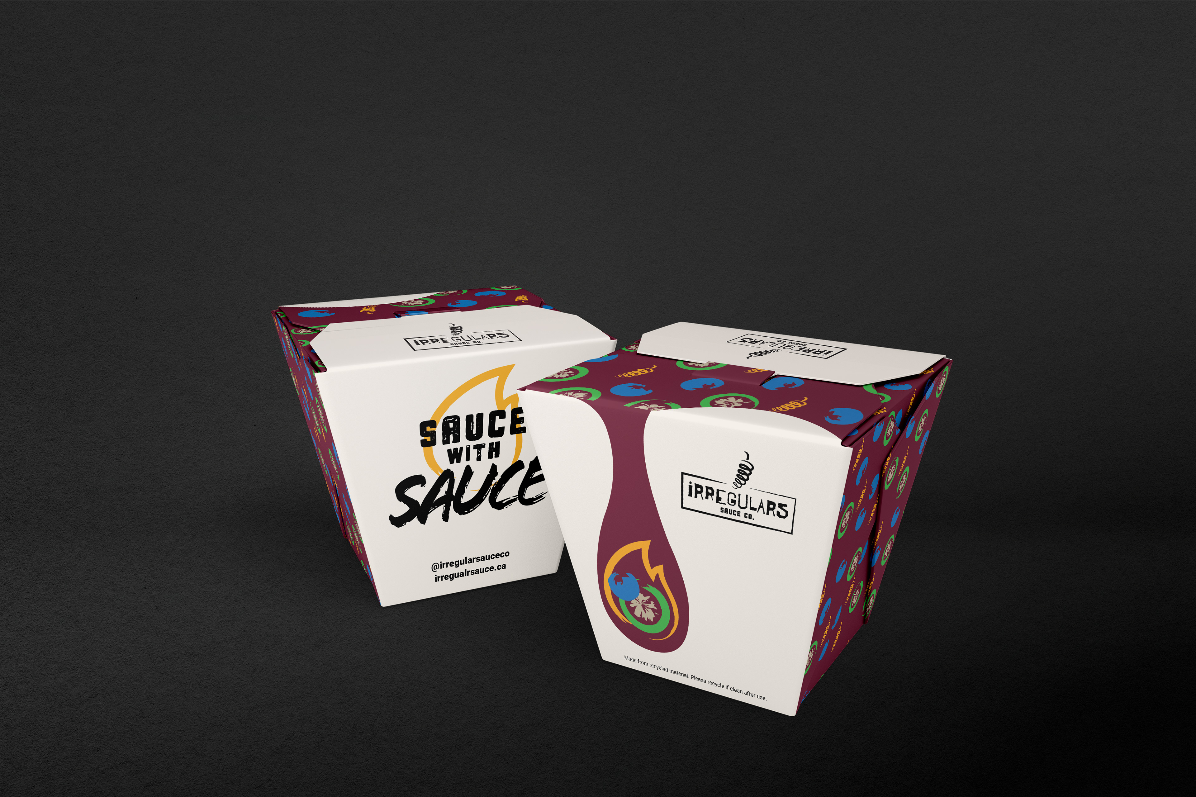
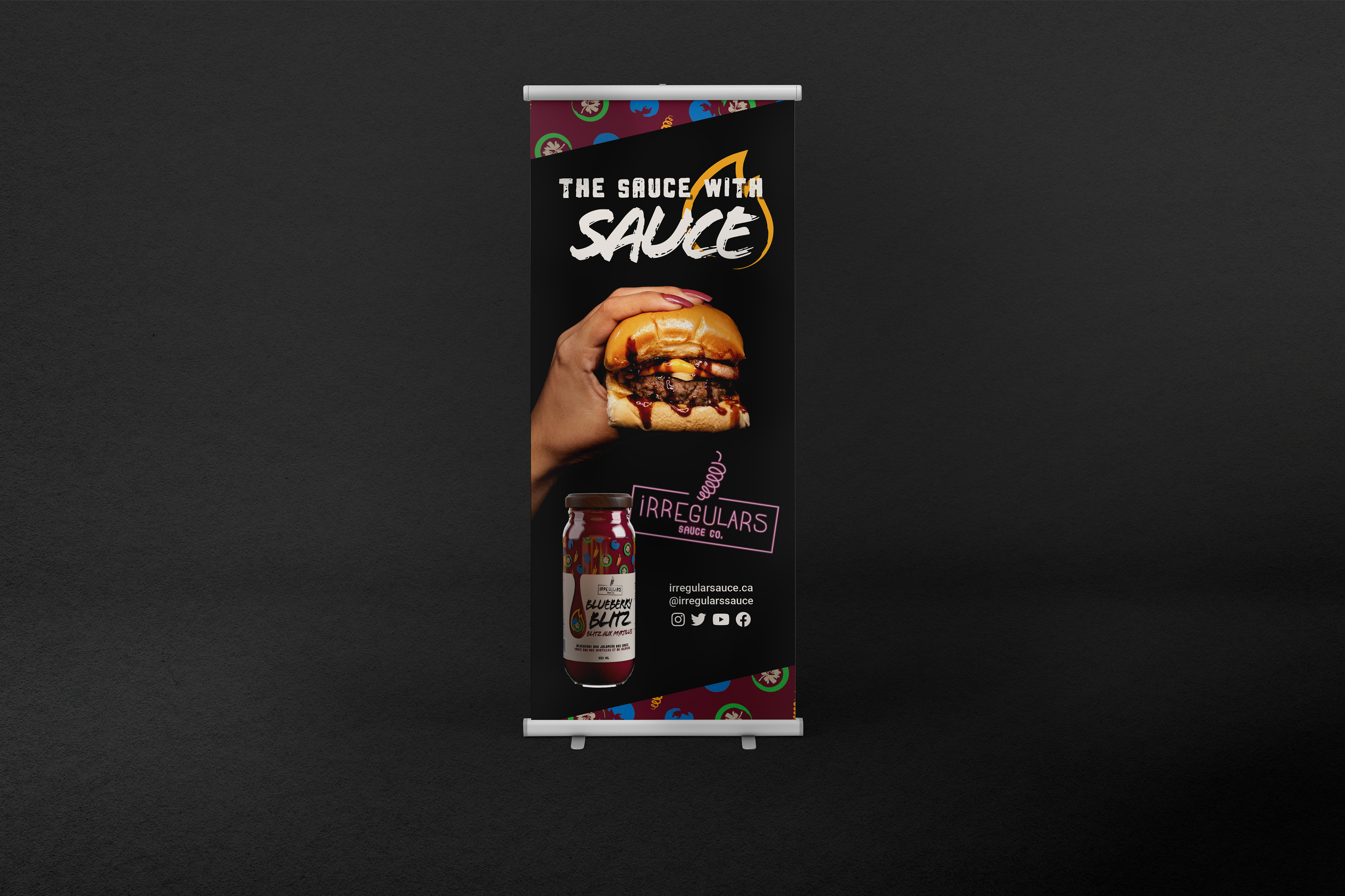
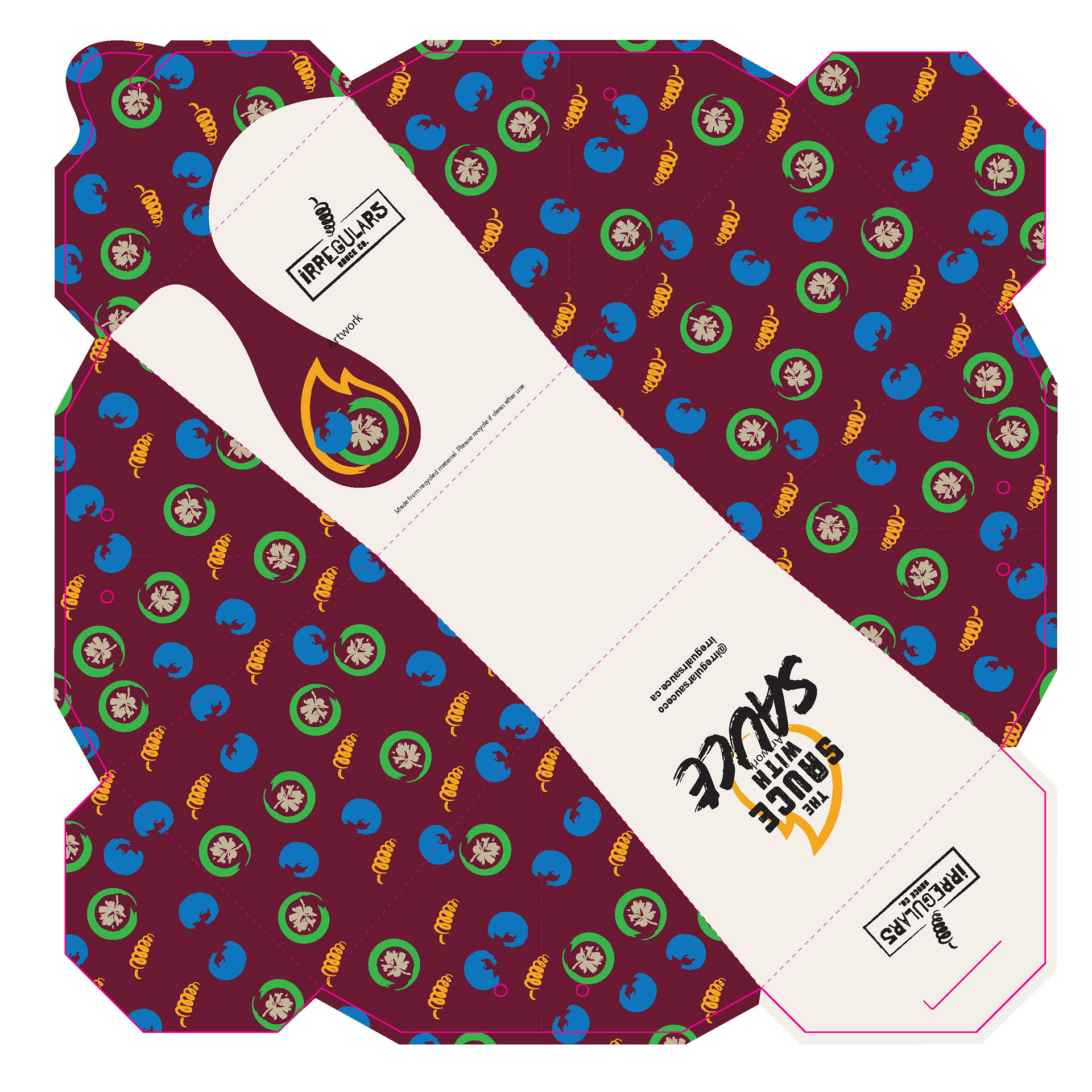
For the Irregulars logo, I chose a font that had irregularities in its weight, spacing, and height. I created a pepper-shaped tornado symbol as an identifier for the brand. Before I began designing the label and box, I first decided on a flavour. Once I landed on Blueberry Jalapeno, I designed a pattern of the two ingredients and the pepper from the logo. I wanted the background of the pattern to be the colour of the sauce - or, better yet, the sauce itself. The handwritten header and wooden lid create a homemade feeling to the bottle design. I also made a box with the same design style, a takeout box and a promotional banner.
MEDIUM/TOOLS USED
Adobe Illustrator, Dimension, InDesign