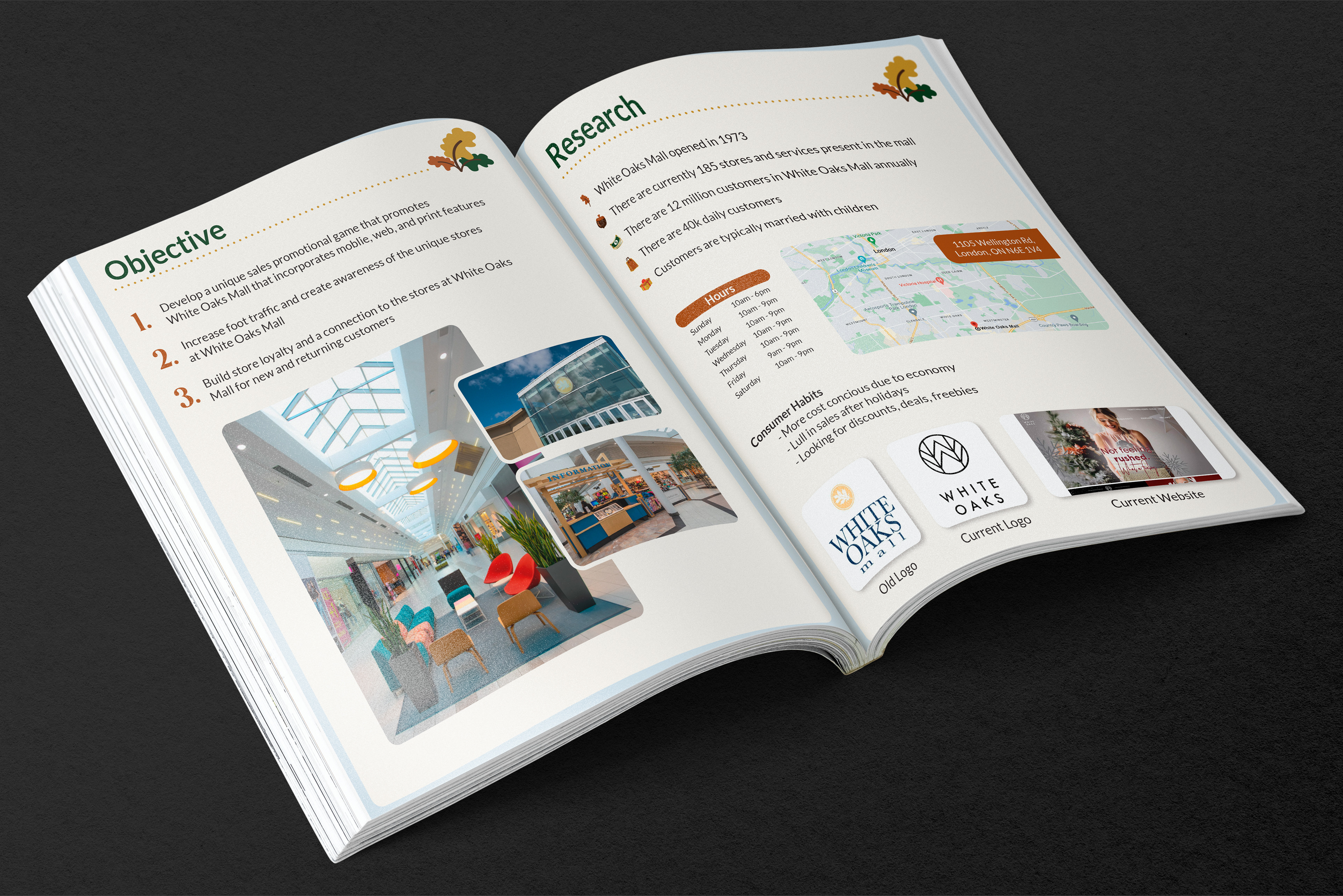
For this group project, consisting of myself, Brittany Luckhurst, Lam Dong and Nelson Dah, we were tasked to create a game that drew customers into White Oaks Mall and the businesses that reside within it. This game had to fit the current brand yet have its own style. Here I will focus only on the work I did for this project.
──────────── PROCESS BOOK AND STYLE GUIDE ────────────


PROCESS
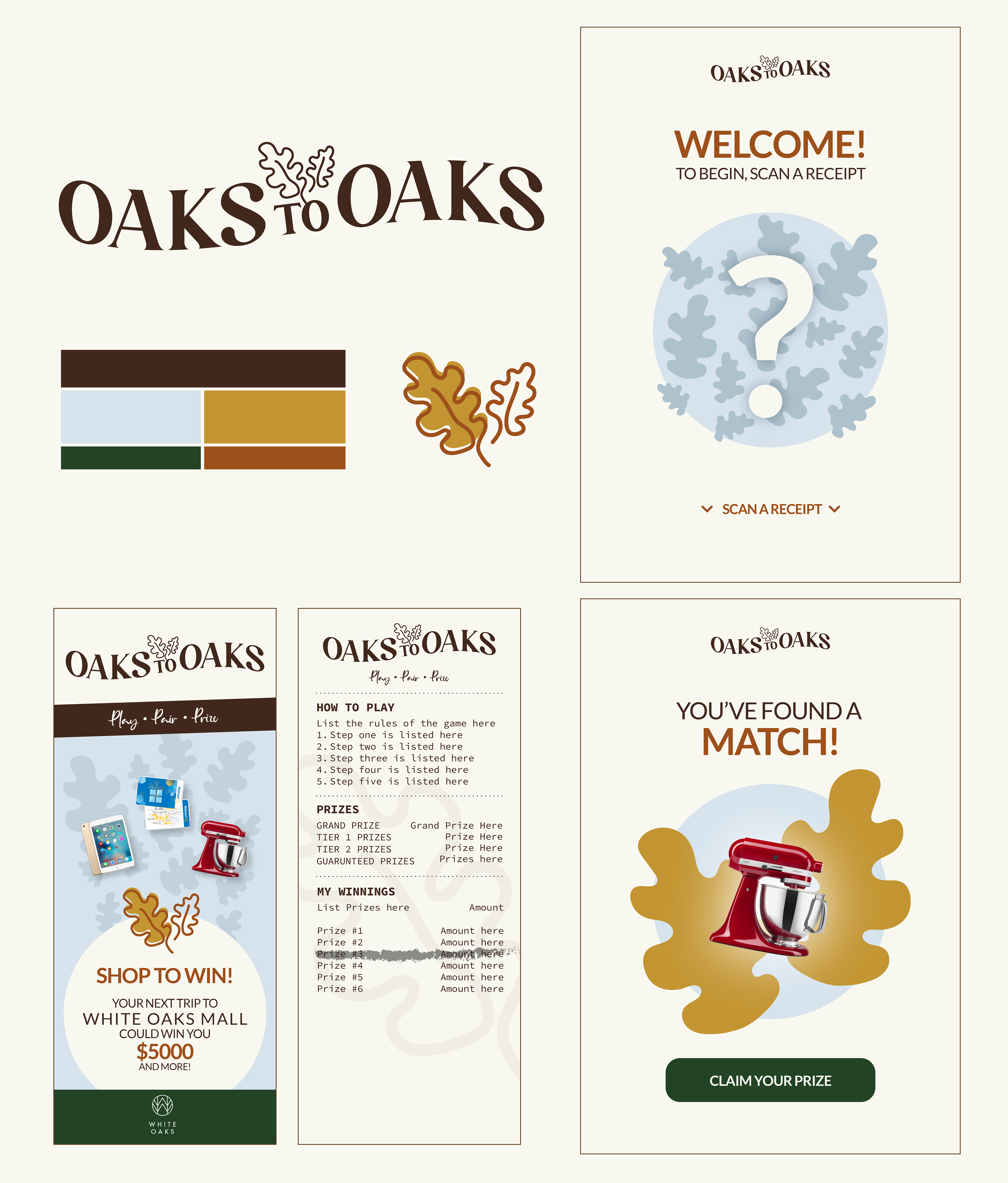
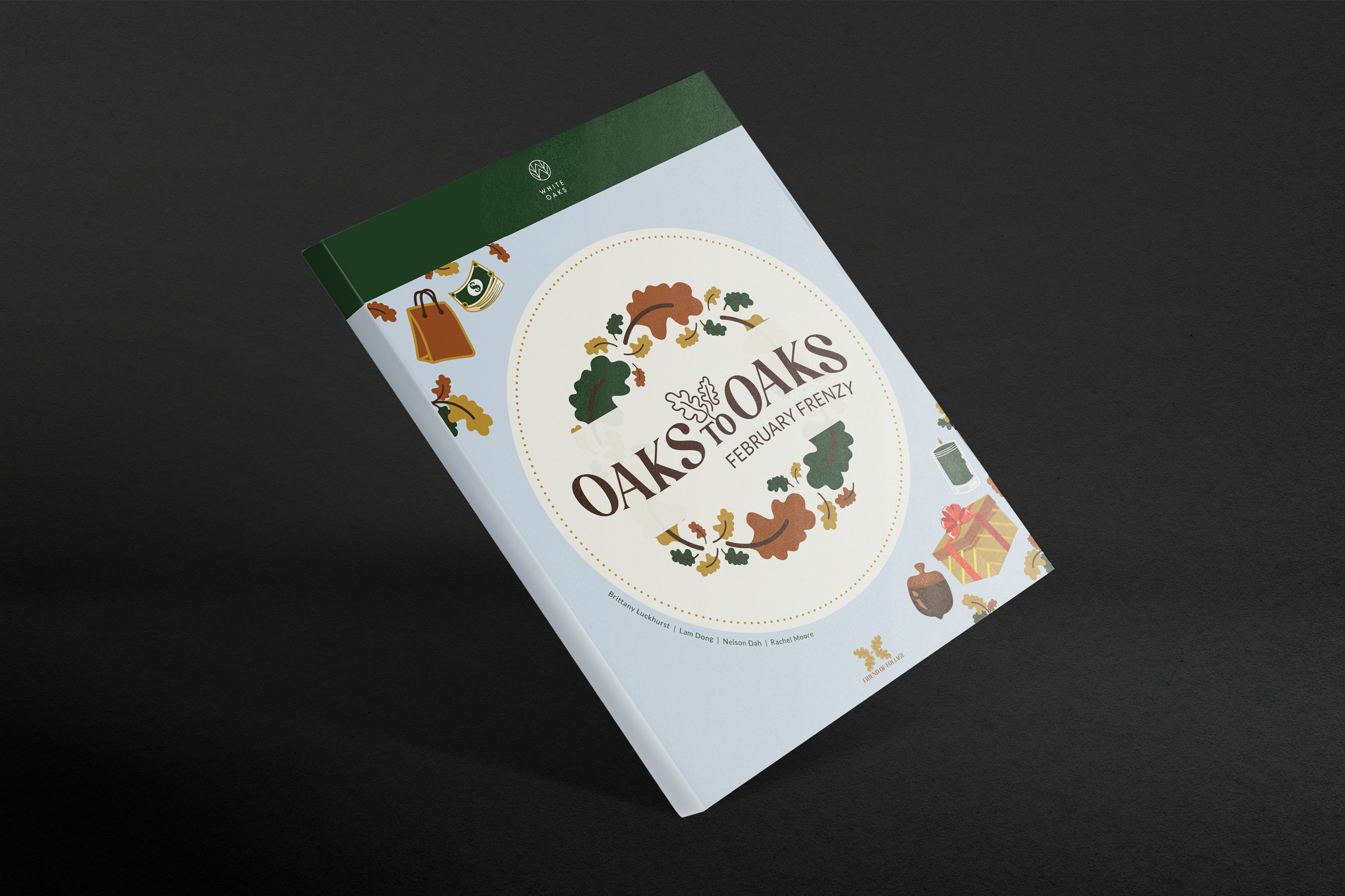
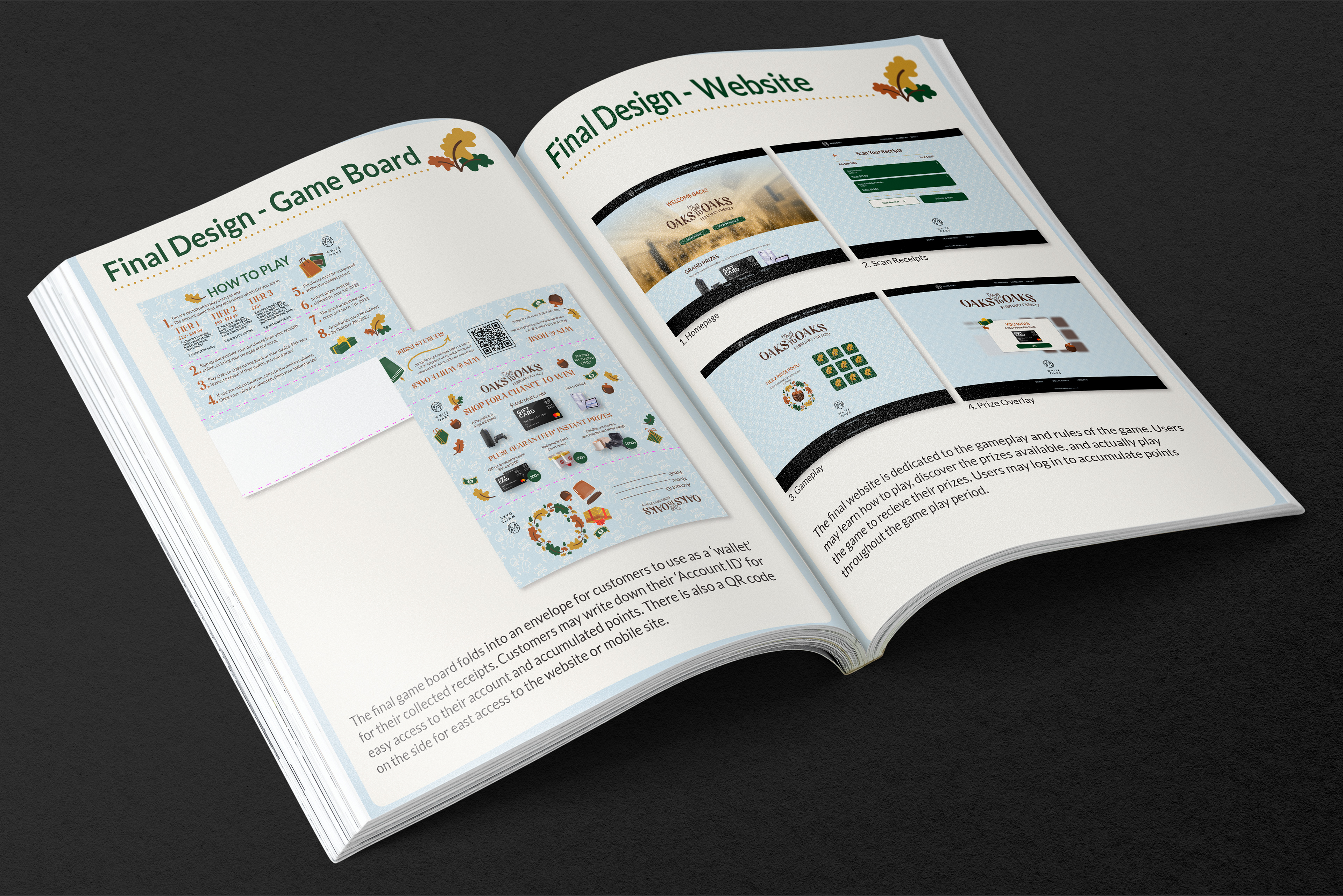
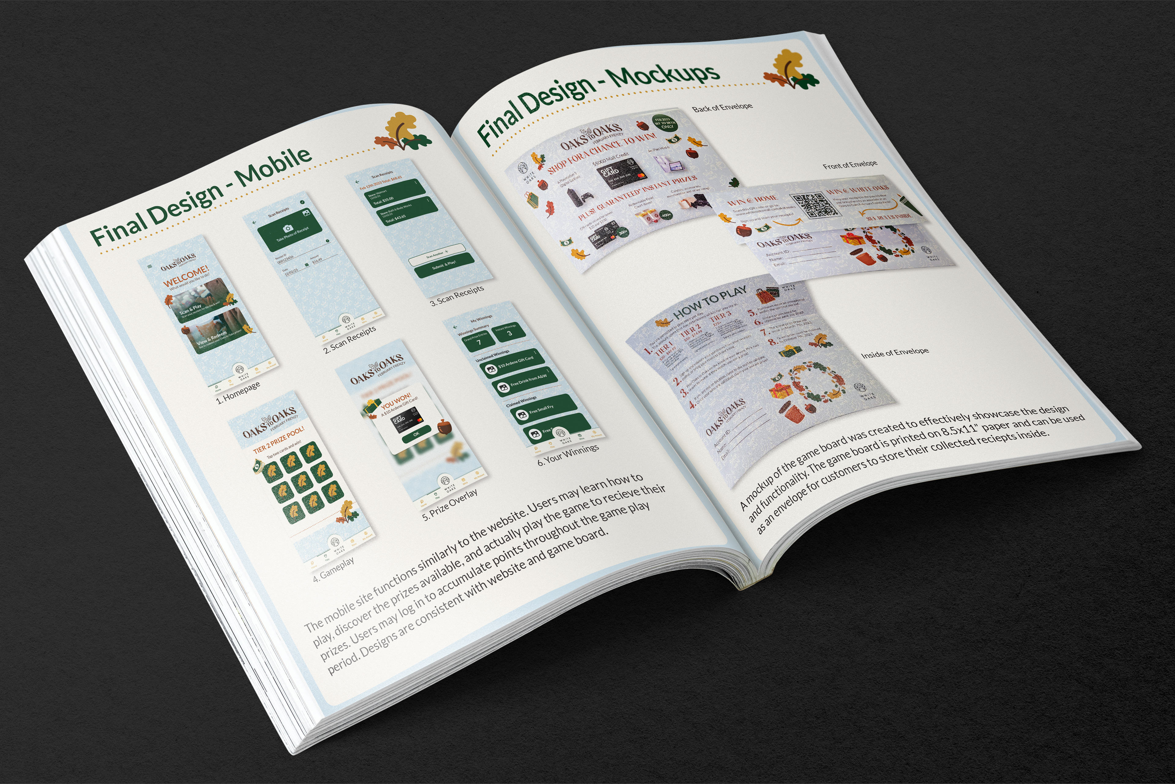
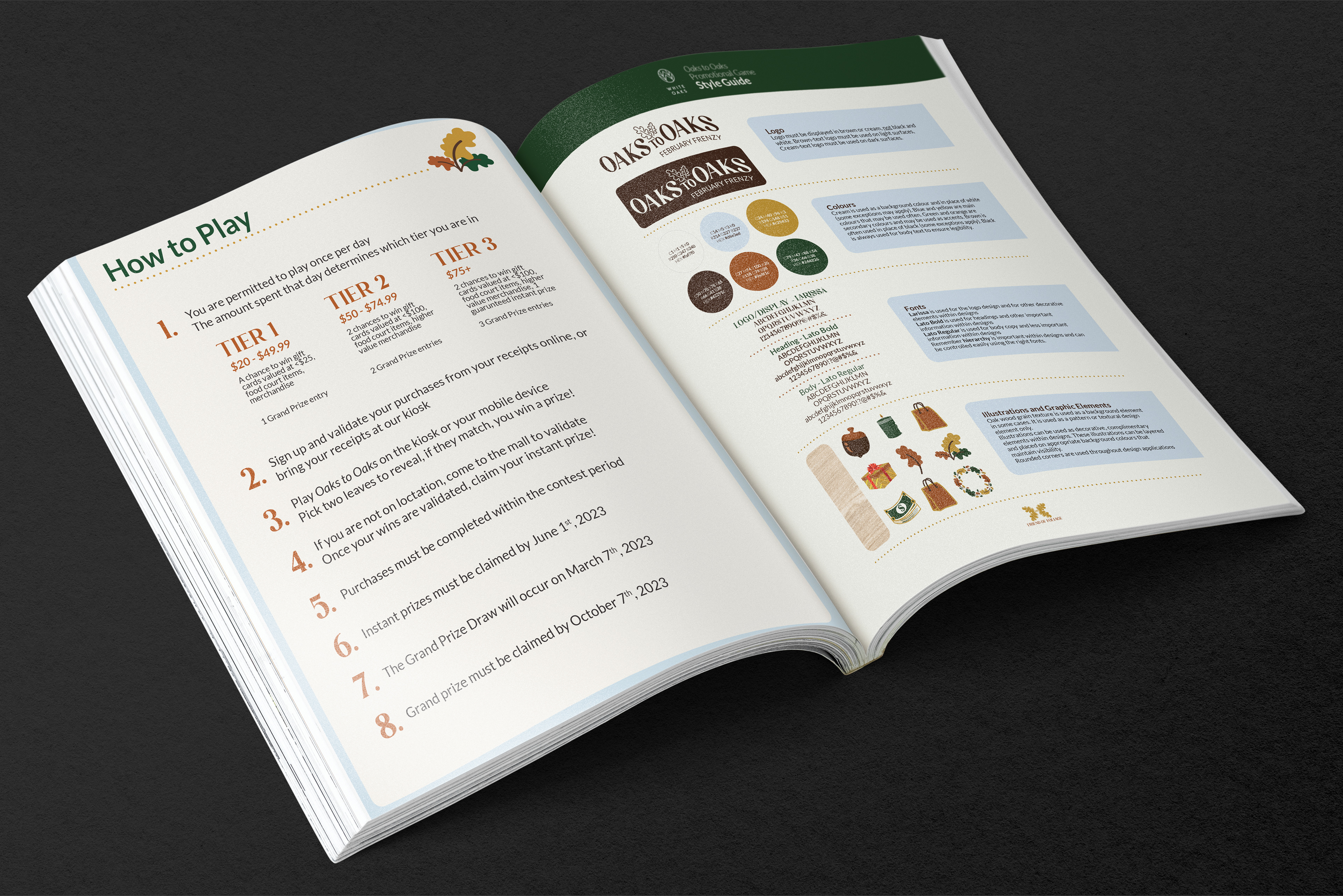
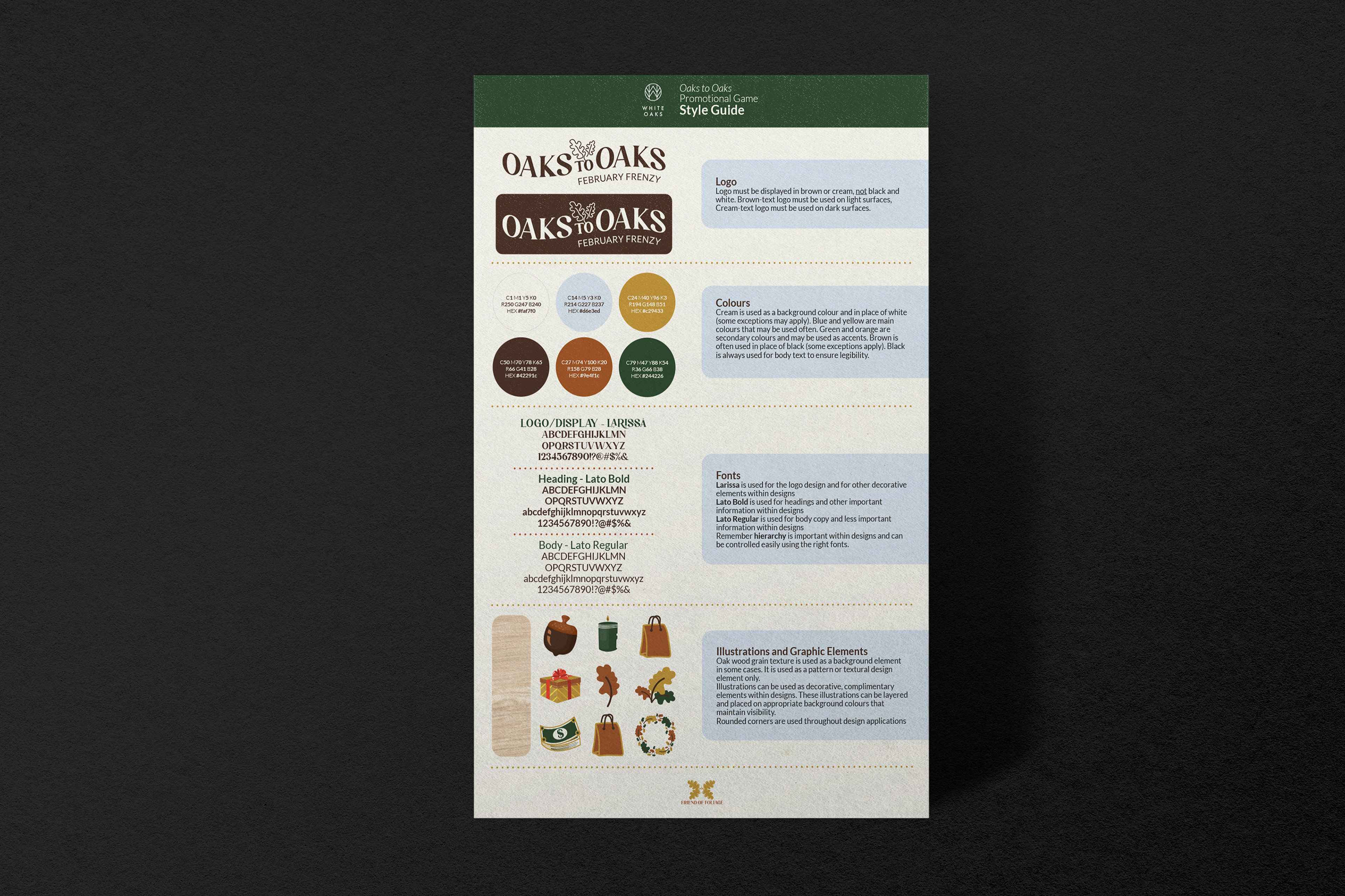
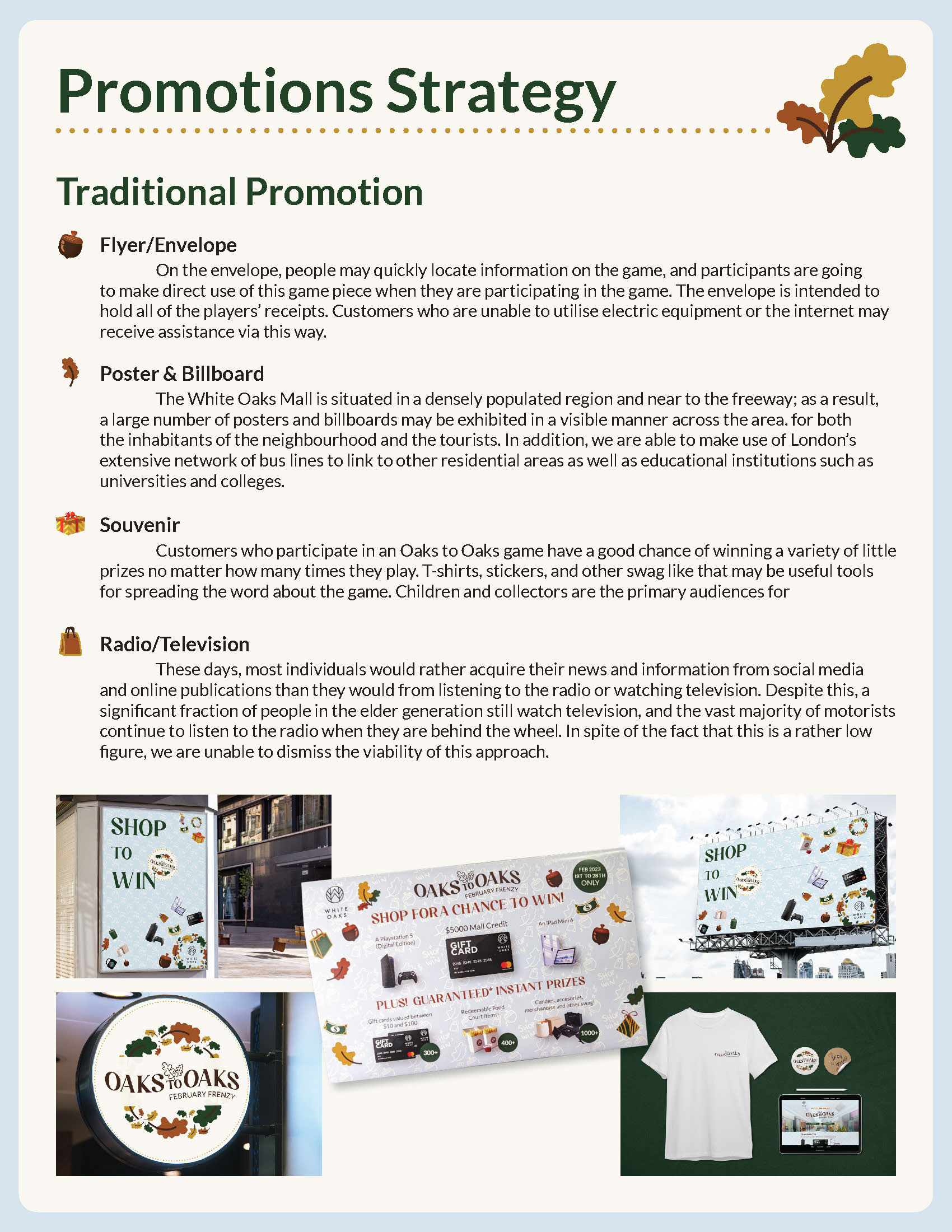
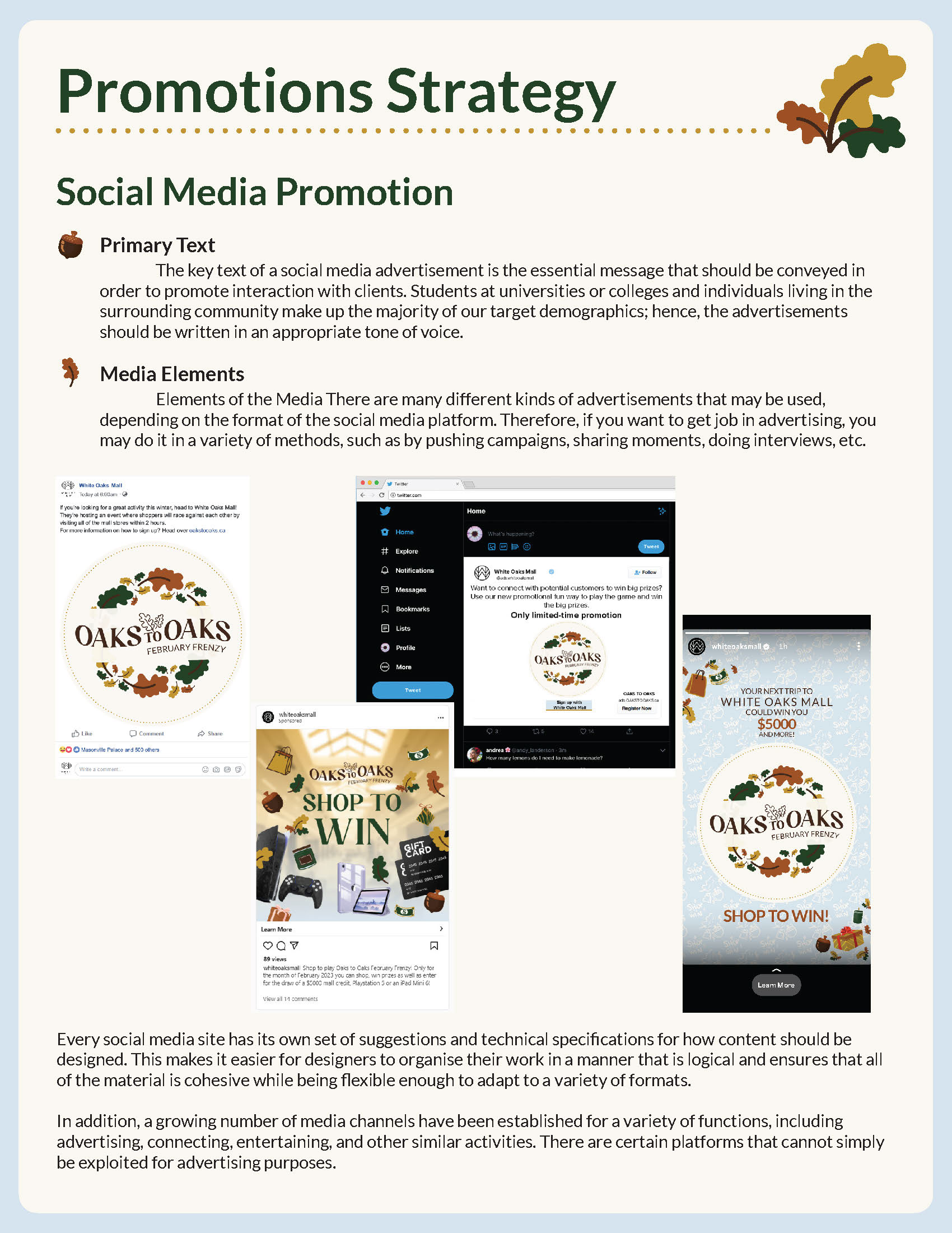
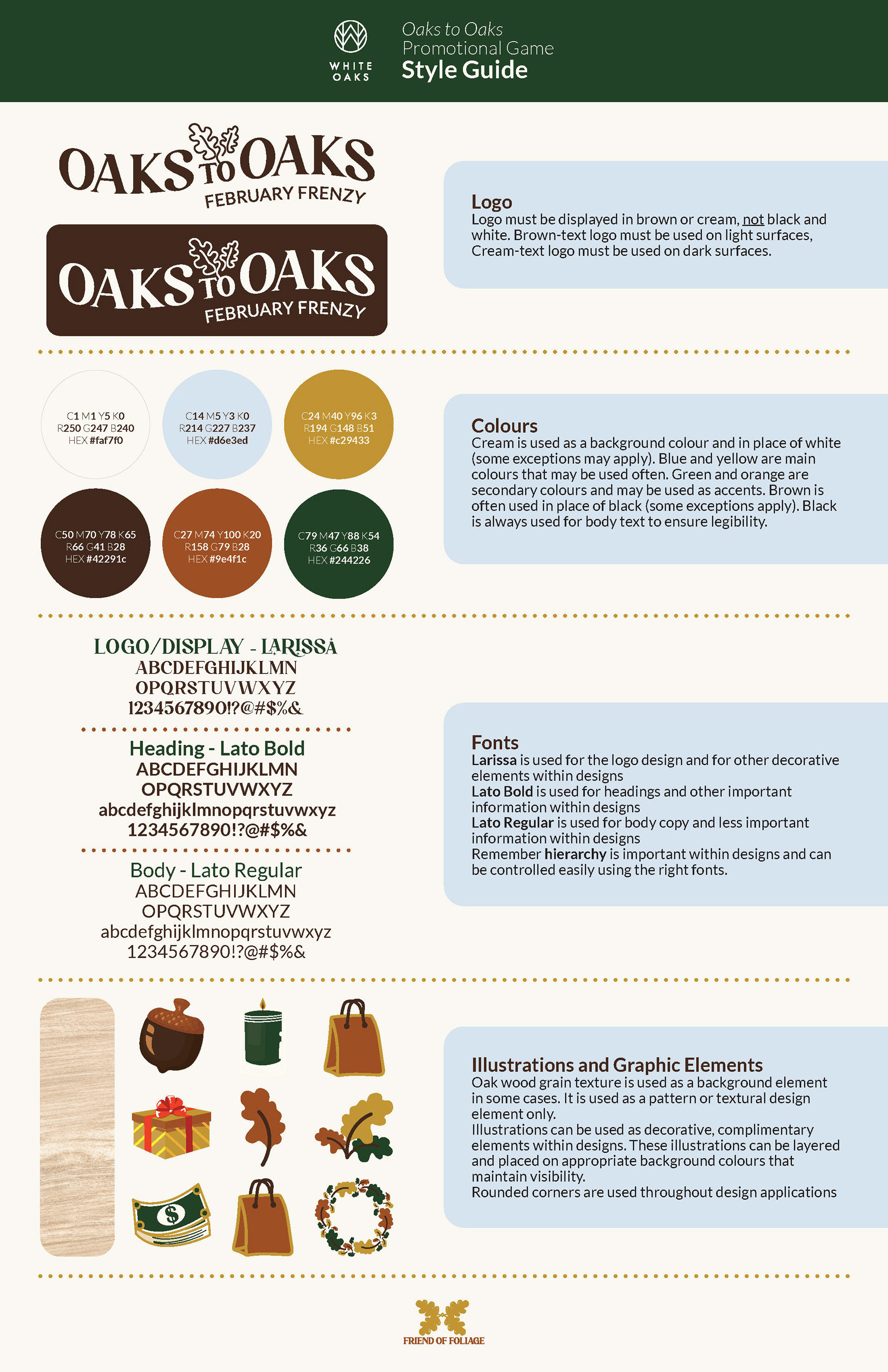
My logo and brand identity designs were inspired by White Oaks Mall’s old logo, which consisted of a serif font in all caps with an oak leaf illustration. I created the text in a banner shape to bring some ‘fun’ into the overall feeling of the game. The final illustrations were done by Lam, which I arranged into the logo to bring more life into the design. I used friendly and comfortable colours, as the target audience requires accessibility. I created the team’s process book and developed the brand’s style guide, and made one example of an Instagram ad for the game. On these layouts, I kept the design consistent and familiar. This was my first time working with a team, and I learned so much from my fellow designers.
My logo and brand identity designs were inspired by White Oaks Mall’s old logo, which consisted of a serif font in all caps with an oak leaf illustration. I created the text in a banner shape to bring some ‘fun’ into the overall feeling of the game. The final illustrations were done by Lam, which I arranged into the logo to bring more life into the design. I used friendly and comfortable colours, as the target audience requires accessibility. I created the team’s process book and developed the brand’s style guide, and made one example of an Instagram ad for the game. On these layouts, I kept the design consistent and familiar. This was my first time working with a team, and I learned so much from my fellow designers.
MEDIUM/TOOLS USED
Adobe InDesign, Illustrator, Photoshop
Adobe InDesign, Illustrator, Photoshop