
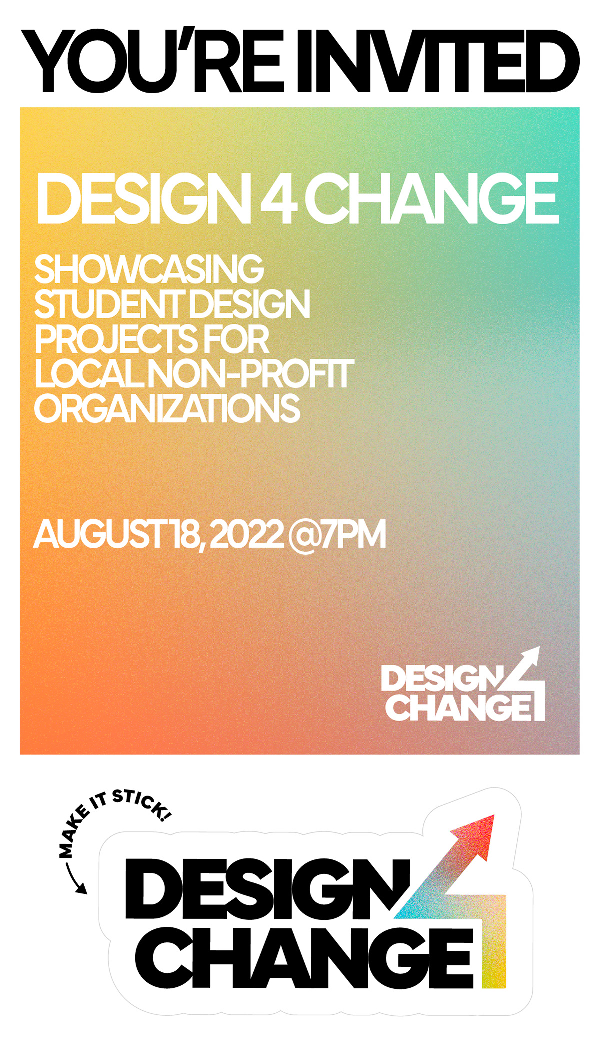
This work was part of Fanshawe Graphic Design’s ‘Design 4 Change’ capstone project.
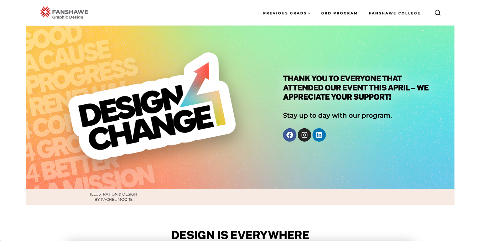
Design 4 Change is a final showcase of Fanshawe Graphic Design student design projects. It highlights the work done in collaboration with Non-Profit Organizations in London, Ontario, and was planned and designed by the students in the
graphic design program. All students had an opportunity to develop a logo and identity idea for the event, and ultimately
my work was chosen for the final event branding. From there, all students created deliverables based on this design
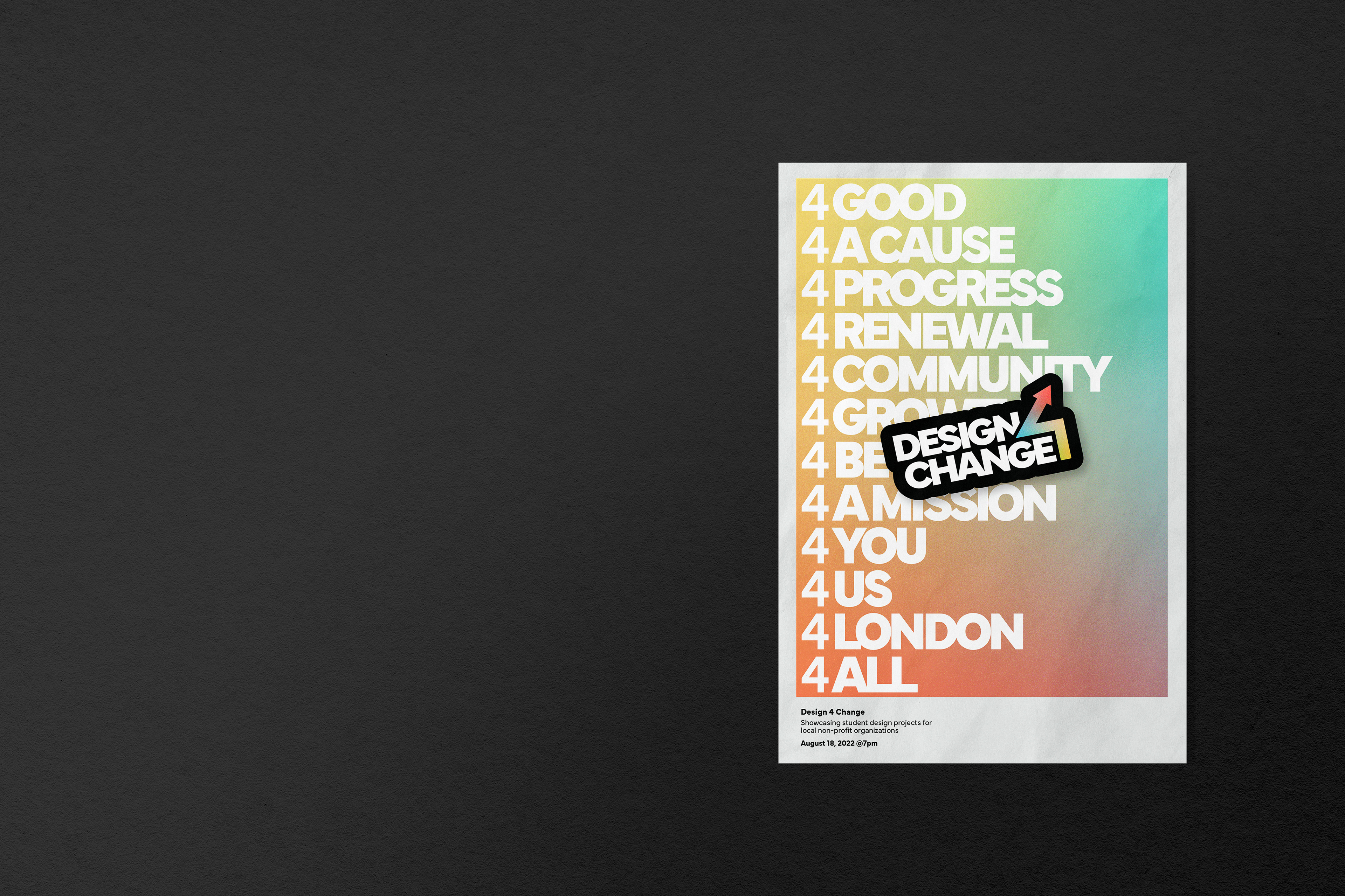
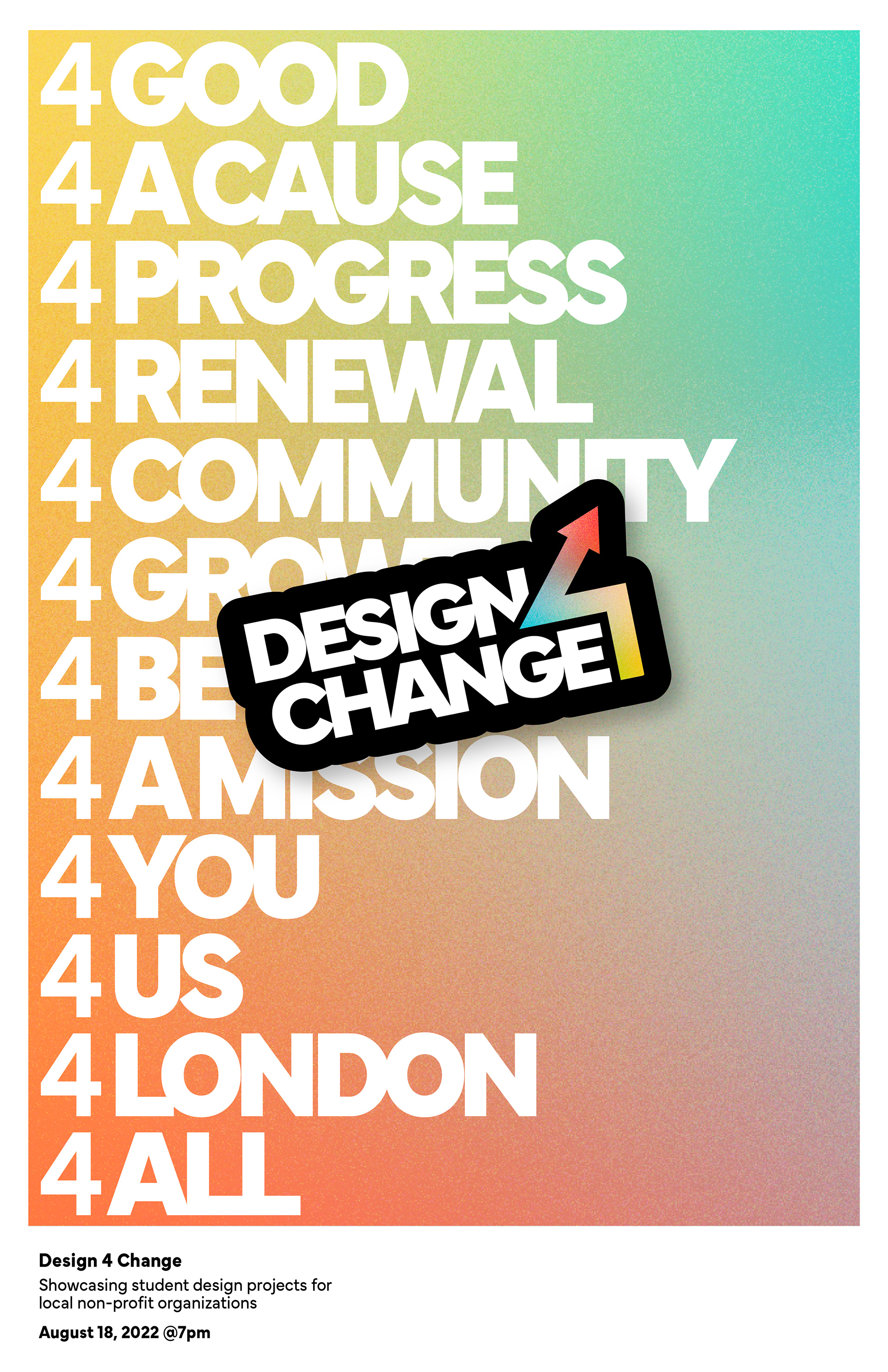
to create a great event plan. Here, I showcase the initial deliverable concepts I developed and my logo design.
graphic design program. All students had an opportunity to develop a logo and identity idea for the event, and ultimately
my work was chosen for the final event branding. From there, all students created deliverables based on this design
to create a great event plan. Here, I showcase the initial deliverable concepts I developed and my logo design.
──────────── LOGO AND IDENTITY ────────────


PROCESS
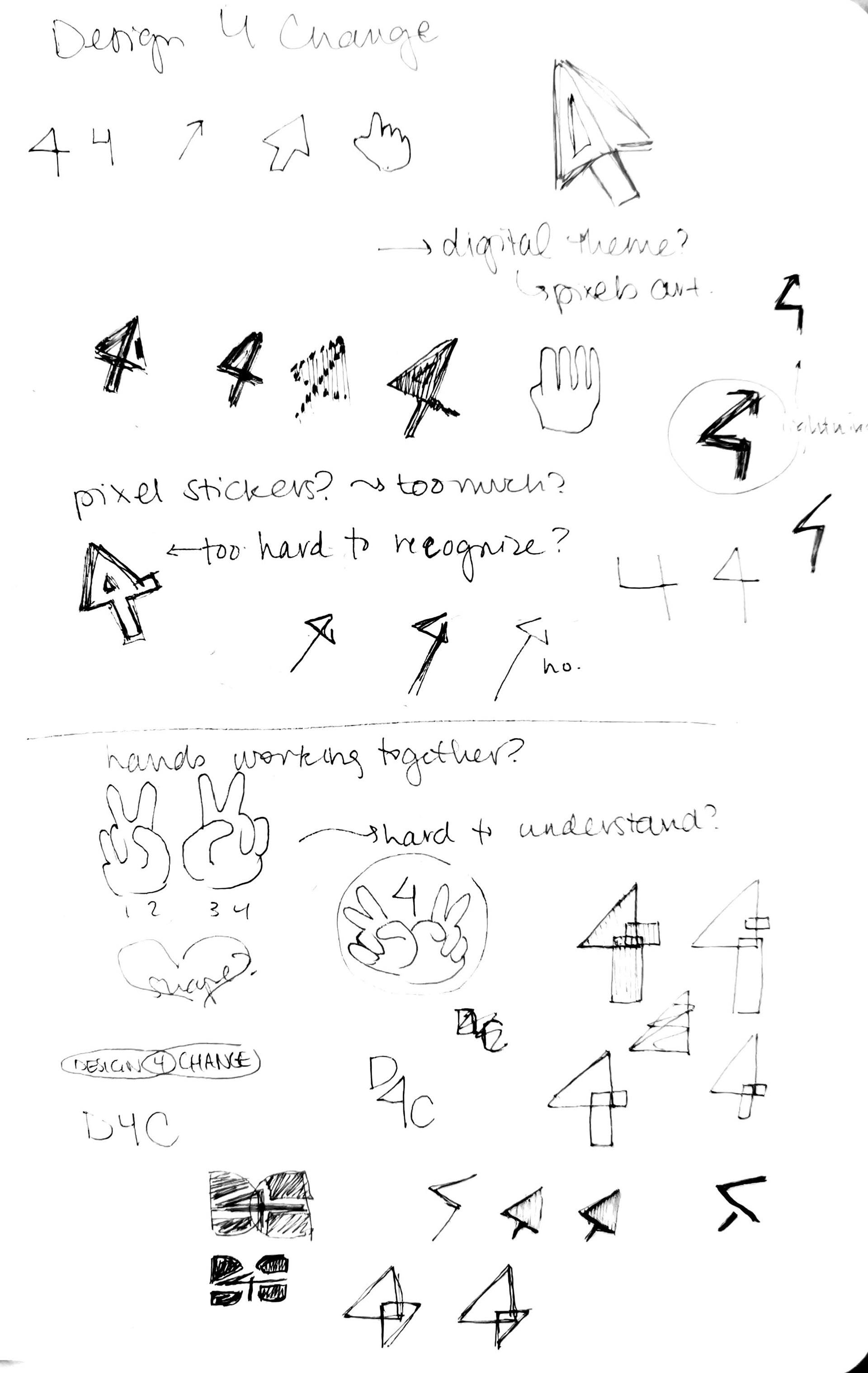
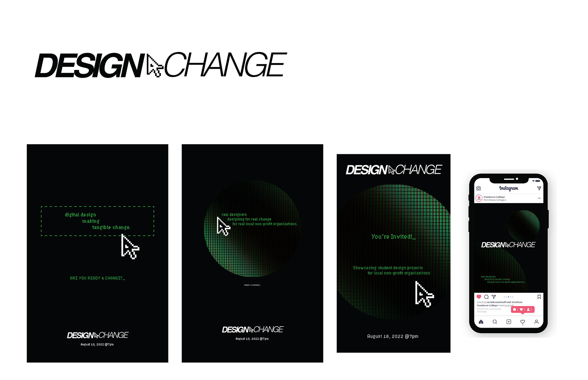
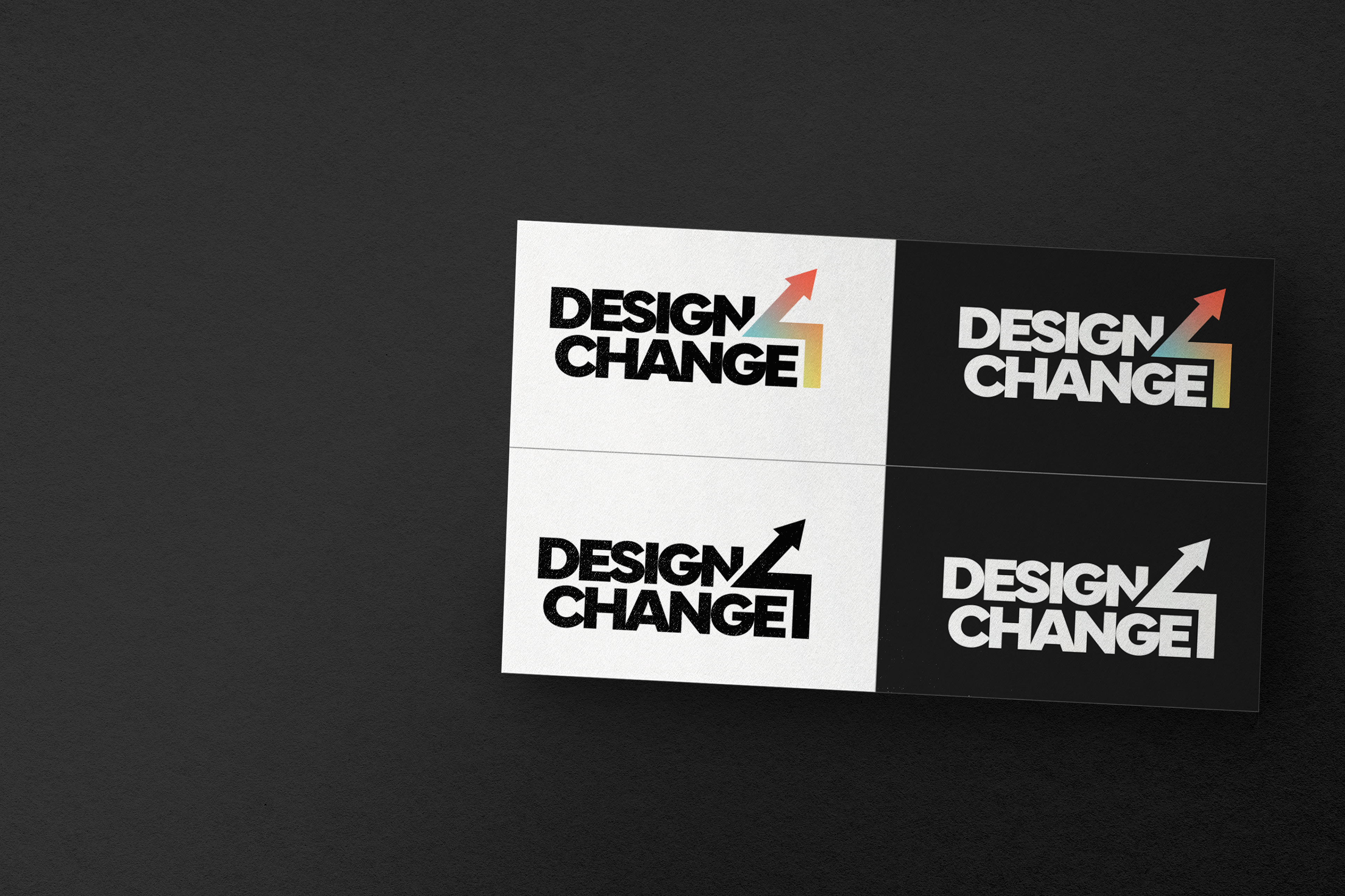
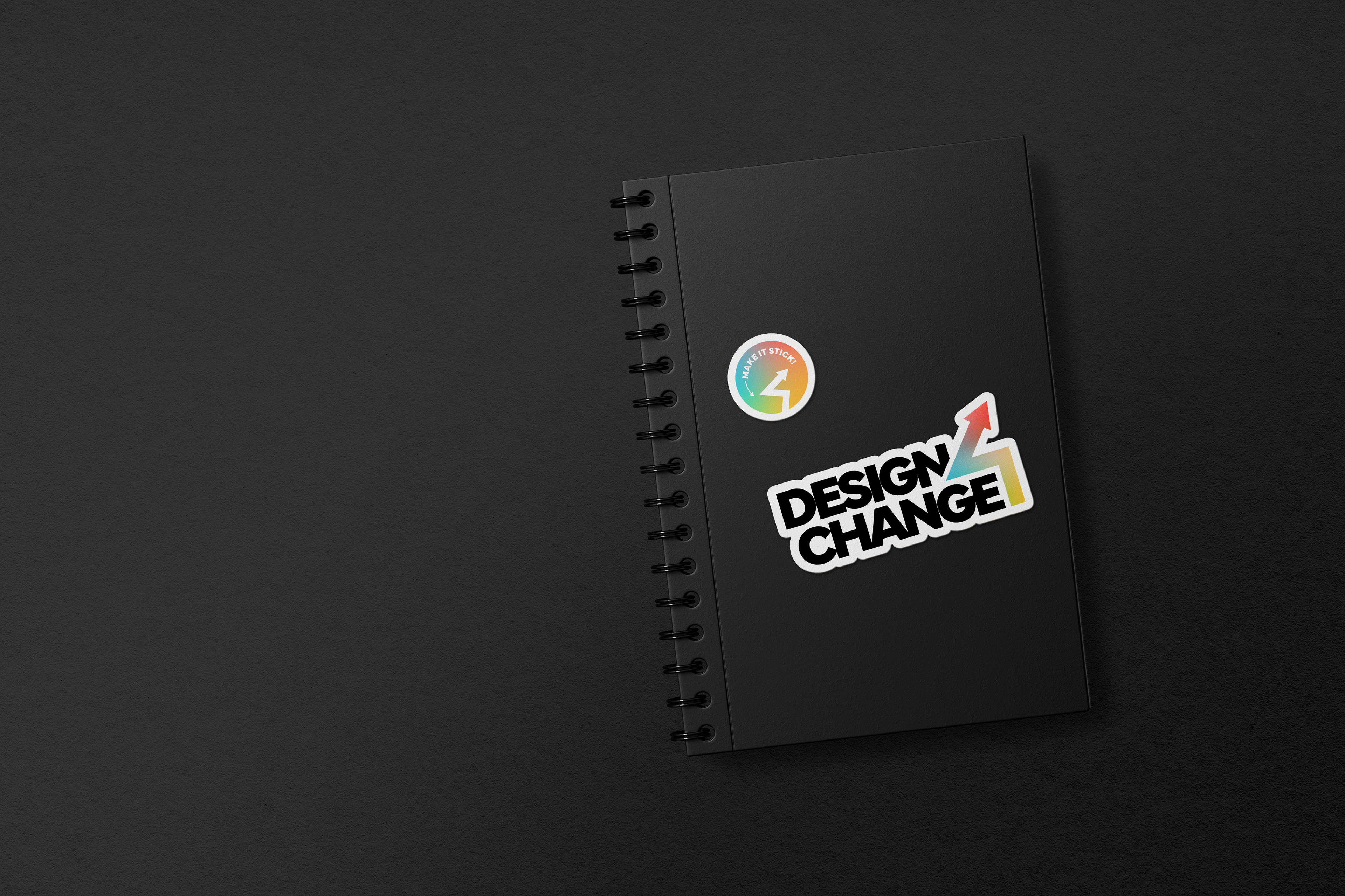
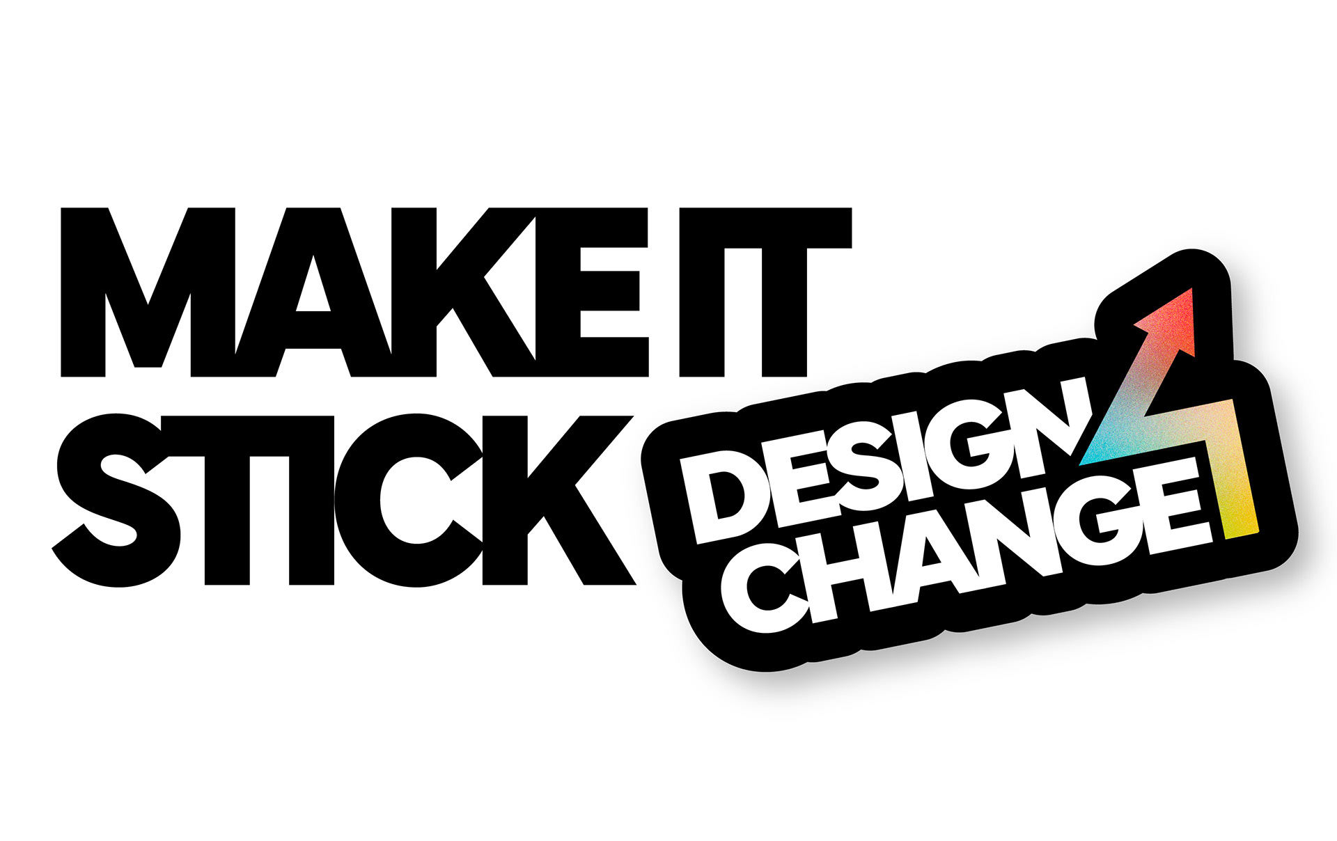
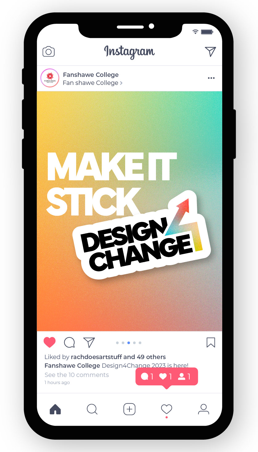
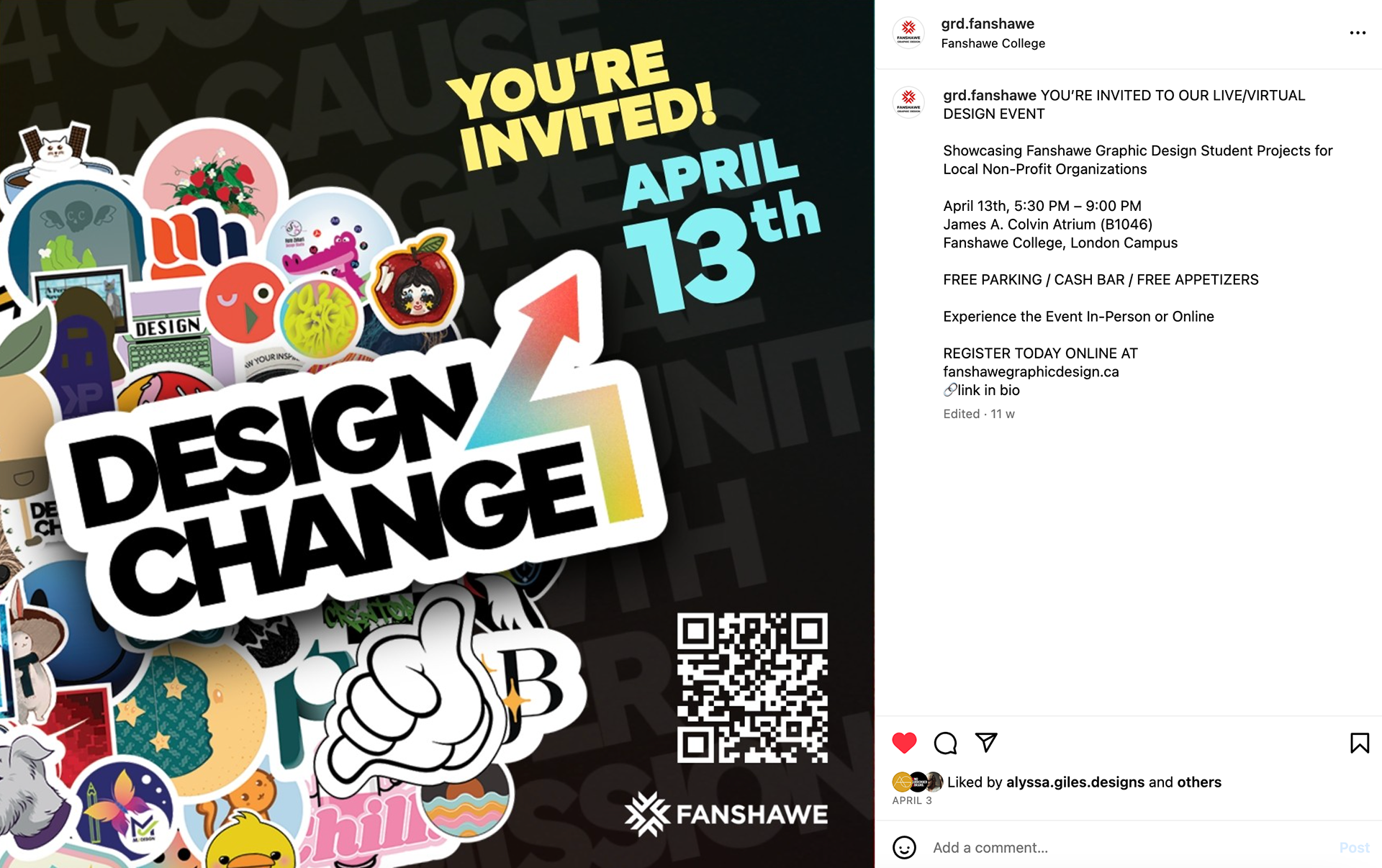
Planning for this project consisted of drawing up the number 4 in different styles and morphing it into a symbol logo. The number 4 resembles the shape of an arrowhead, a symbol of strength, protection, and new directions. This was a perfect visual sign for an event which showcases student work and non-profit organizations. The final logo features a gradient background with subtle grain added for a smooth, colourful element. One practical branding element for Design 4 Change is the use of stickers. Stickers are a very effective form of marketing as they are inexpensive, small to produce, and can be stuck on virtually anything. They are also fun and memorable souvenir items to hand out during the event. The headline ‘Make it Stick’ means to make your design work memorable and long-lasting. I wanted the event's branding to incorporate the work of all students involved, having everyone create their own sticker that represents them as a designer - to make their hard work 'stick' to the event's brand.
Planning for this project consisted of drawing up the number 4 in different styles and morphing it into a symbol logo. The number 4 resembles the shape of an arrowhead, a symbol of strength, protection, and new directions. This was a perfect visual sign for an event which showcases student work and non-profit organizations. The final logo features a gradient background with subtle grain added for a smooth, colourful element. One practical branding element for Design 4 Change is the use of stickers. Stickers are a very effective form of marketing as they are inexpensive, small to produce, and can be stuck on virtually anything. They are also fun and memorable souvenir items to hand out during the event. The headline ‘Make it Stick’ means to make your design work memorable and long-lasting. I wanted the event's branding to incorporate the work of all students involved, having everyone create their own sticker that represents them as a designer - to make their hard work 'stick' to the event's brand.
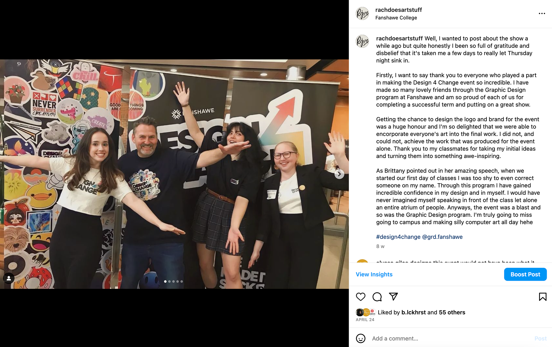
During preparation for the event, I assisted in producing the class presentation of our collective assets, the assembly of our Group Book, running team meetings, and the production of the class stickers. During this project, I had the opportunity to try creative directing this project with the help of other classmates. This challenged me to take the lead in many group discussions and helped me feel more confident as a collaborator and designer.
MEDIUM/TOOLS USED
Adobe InDesign, Illustrator, Photoshop
Adobe InDesign, Illustrator, Photoshop